Blog
How to Choose Statement Art for Modern Living Spaces: Scale, Medium, and Color Harmony
In contemporary interior architecture, a room's character is defined not by the density of its furnishings, but by the intentionality of its focal point. While mass-produced decorative prints often feel interchangeable, incorporating statement art for modern living room environments introduces irreplaceable soul, scale, and emotional resonance. A single masterfully executed canvas possesses the gravitational pull to unify high ceilings, anchor seating arrangements, and initiate enduring conversation.
Yet, choosing large-scale statement artwork involves far more than simply selecting colors that match throw pillows. It requires balancing mathematical proportion against intuitive aesthetic emotion. How wide should a canvas be relative to your sofa? How do directional pigments react to changing sunlight? And how can contrasting abstract palettes harmonize minimal Scandinavian or brutalist interior architecture? This definitive design guide outlines the curatorial principles of scale, medium, and color harmony for integrating museum-quality original art into refined modern living spaces.
1. The Mathematics of Scale: Sizing Canvas Art Over Furniture
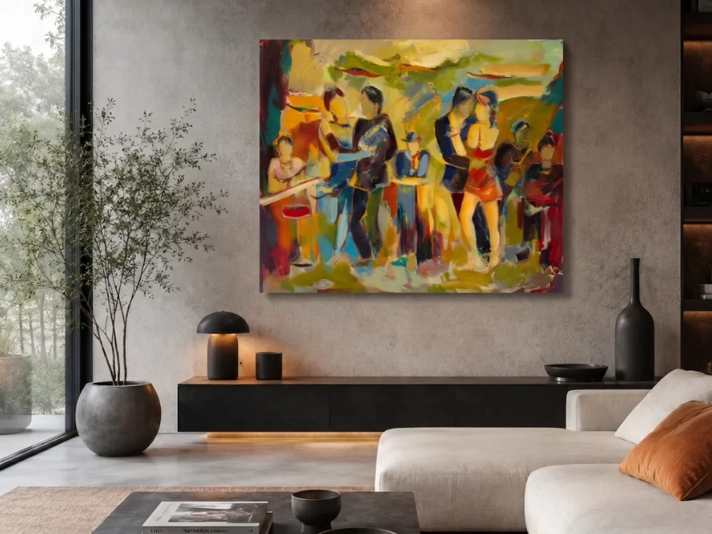
The two-thirds rule: pairing bold, textured statement artwork with proportional furniture width to maintain spatial harmony.
The most pervasive error in interior styling is selecting artwork that is timid in scale. An undersized canvas stranded on an expansive drywall expanse appears lost, creating unintended visual clutter. Conversely, an oversized piece that encroaches too closely on ceiling moldings or door frames suffocates architectural breathing room.
To achieve professional gallery balance, professional interior architects follow these proportion guidelines:
- The Two-Thirds (60% to 75%) Ratio: When positioning an original canvas over a primary furniture anchor—such as a low-profile sectional sofa, long credenza, or fireplace mantel—the width of the artwork should span approximately two-thirds to three-quarters of the furniture's total width. For instance, an 8-foot sofa calls for a canvas spanning roughly 5 to 6 feet in horizontal presence.
- Vertical Clearance: Allow a clean buffer of 6 to 10 inches (15 to 25 cm) between the bottom edge of the frame or stretcher bar and the top of the sofa back or console surface. This ensures visual connection while preventing accidental contact.
- Commanding Spatial Presence: Consider Sergey Khachatryan's powerful acrylic masterwork "Taming". Its dynamic figurative energy and expansive surface area command wall architecture effortlessly, establishing an immediate gravitational anchor in neutral, open-concept living rooms.
2. Color Harmony: Balancing Emotional Temperature in Contemporary Rooms
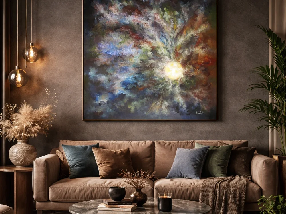
Color resonance and emotional atmosphere: using nuanced abstract compositions to balance interior tone and ambient daylight.
Color in fine art operates on emotional and architectural wavelengths. When choosing large canvas paintings for home decor, the objective is never mere camouflage. Great statement pieces establish dynamic dialogue—either by creating a harmonious monochromatic continuation or introducing a deliberate, electrifying counterpoint.
The 60-30-10 Rule Extended to Fine Art
In classic interior design, rooms balance 60% dominant neutral wall tone, 30% secondary upholstery and woodwork texture, and 10% high-chroma accents. An authentic statement piece can either reflect the secondary 30% to deepen serene cohesion or embody the vibrant 10% accent to infuse energetic vitality into an otherwise monochromatic interior.
Balancing Warm and Cool Temperatures
Rooms dominated by cool architectural materials—such as polished concrete flooring, blackened steel framing, and Carrara marble—benefit dramatically from the organic warmth of earth pigments. In "Decomposition" by Anania Kocharyan, the intricate, layered abstraction interweaves complex earthen undertones with striking contrast, softening crisp modern geometry with intellectual depth.
3. Medium Synergy: Oil, Acrylic, and Surface Light Interaction
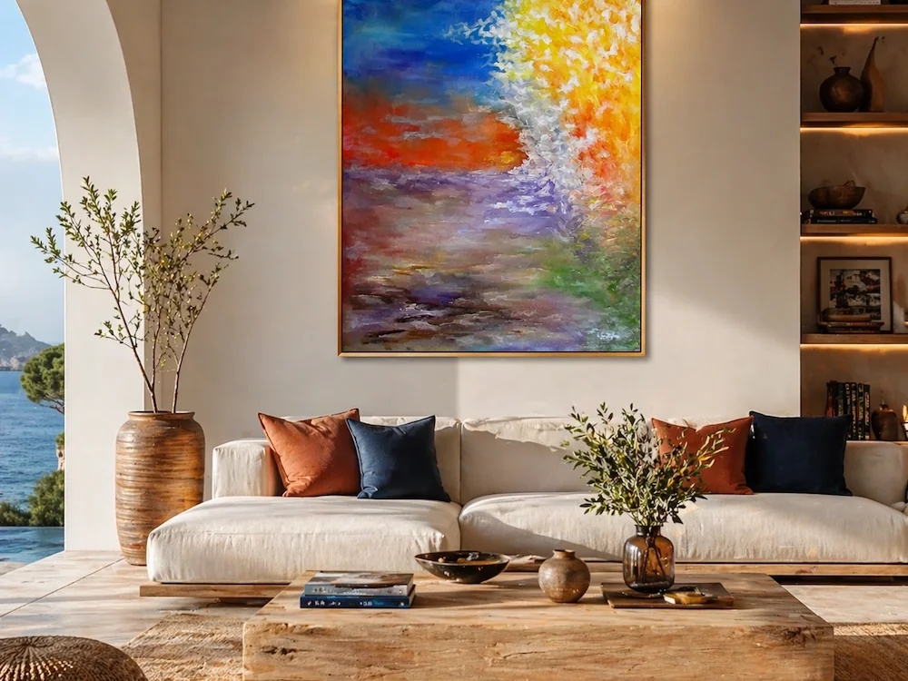
Tactile richness: organic textures and expressive brushwork introducing natural vitality into clean architectural spaces.
The choice between oil and acrylic mediums substantially alters how a painting interacts with a living room's lighting schema throughout the day. While flat giclée prints reflect harsh glare, original textured paints absorb and refract ambient daylight through sculptural impasto.
Tactile Impasto vs. Smooth Minimal Glazes
Heavy impasto brushwork, sculpted with palette knives, creates physical relief that casts micro-shadows under directional light. In Anania Kocharyan's "Flourishing", vigorous botanical-abstract brushwork introduces organic movement and sculptural texture into structured rooms, reflecting daylight dynamically from morning to dusk.
Monumental Classical Formats
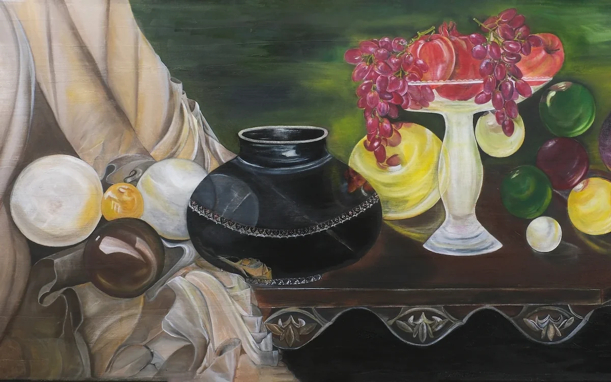
For grand living spaces with classical or transitional architecture, large-format still life compositions like "Still Life" by Hasmik Khalafyan offer timeless gravitas. Measuring an impressive proportion, Khalafyan's interplay of dark ceramic vessels, deep drapery folds, and luminous fruit renders the piece an enduring centerpiece above grand credenzas.
4. Installation Precision: Sightlines, Centerlines, and Negative Space
Even the most extraordinary original painting can be diminished by careless hanging. Adhering to professional curatorial museum standards ensures your investment is showcased at its peak potential.
- The 57-Inch (145 cm) Centerline Standard: Measure 57 inches from the finished floor to the midpoint of your canvas. When positioned in living spaces where viewing is predominantly seated, lower the centerline slightly to 54–56 inches to align directly with seated eye levels.
- Respecting Negative Space: Allow at least 12 to 18 inches of unimpeded wall space on either side of the canvas. Negative space acts as visual breathing room, allowing the artwork to command full focus without fighting adjacent shelving or drapery.
- High-CRI Directional Illumination: Position ceiling-recessed gimbal spotlights or sleek picture lights angled at 30 degrees to minimize glare. Select 2700K–3000K warm white LED lamps with a 95+ Color Rendering Index (CRI) to reveal authentic pigment nuances.
5. Curated Spotlight: Large-Format Masterpieces for Modern Interiors
"Still Life" — Hasmik Khalafyan
Original Oil on Canvas
Grand horizontal format. Sculptural ceramic forms and sumptuous draped linen texture. Ideal for expansive living room walls and statement credenzas.
View Artwork Details →"Taming" — Sergey Khachatryan
Original Acrylic on Canvas
Dynamic modern figurative expressionism. Bold silhouettes and vibrant energy that command high-ceiling architectural lofts.
View Artwork Details →"Flourishing" — Anania Kocharyan
Original Oil on Canvas
Expressive botanical abstraction. Heavy impasto brushwork bringing tactile vitality into minimalist interiors.
View Artwork Details →"Decomposition" — Anania Kocharyan
Original Oil on Canvas | Inquire for Details
Intellectual, complex contemporary abstraction that harmonizes effortlessly with raw architectural materials.
View Artwork Details →“Statement art is not merely an accessory added to complete a room; it is the visual heartbeat around which the entire architecture finds its balance.”
— Curatorial Advisory, ArAr Gallery
Our European gallery curatorial team in Utrecht and Amsterdam offers personalized visual room simulations. Simply submit a photograph of your living space, and our advisors will provide digital scale mockups and lighting recommendations. Explore our full curation of original canvas paintings at ArAr Gallery, all shipped with museum-grade crating and complimentary worldwide insured delivery.